With the introduction of OS version 26, Apple streamlined the user interface across iOS, iPadOS, macOS, watchOS, tvOS, and visionOS. Liquid Glass is now the company’s universal design language, borrowing cues from the Vision Pro’s operating system and preparing for a future dominated by mixed-reality gadgets.
Like any significant redesign, Liquid Glass on iOS 26 is bound to shock certain users when it launches this fall. It’s the most noticeable system overhaul since iOS 7, and it stretches beyond just the iPhone. Fortunately for those averse to change, the update isn’t as impactful as it may appear from afar. Mostly, it applies a glassy, reflective layer to buttons, menus, and navigation bars, but it doesn’t structurally change how you use your iPhone. Your eyes may need a while to adapt—but not your muscle memory.
Apple has tweaked Liquid Glass with each beta update, and it’s sure to evolve several more times before it arrives in the fall. The screenshots here are from the second developer beta.
Breaking down Liquid Glass
As its name suggests, Liquid Glass behaves like glass that has been liquified. In its default state, select UI elements appear like translucent crystal sheets, revealing the content in the background. Upon interacting with these buttons, they smoothly transform from their solid state to a goo-like digital substance. This behavior is most prominently perceived when tapping and holding on a navigation bar, then moving your finger across its different tabs.
Foundry
To make user touches more life-like, dragging your finger from one Liquid Glass button to another will temporarily morph them via a thin, fluid bond. The design language also actively relies on HDR to intensify user taps on Liquid Glass by incorporating bright gleams. In other system parts, such as the Lock Screen, the glass refracts light and generates vibrant colors as you swipe on it like a realistic glass prism would. It’s modern, alive, and fun to interact with.
Where glass lives
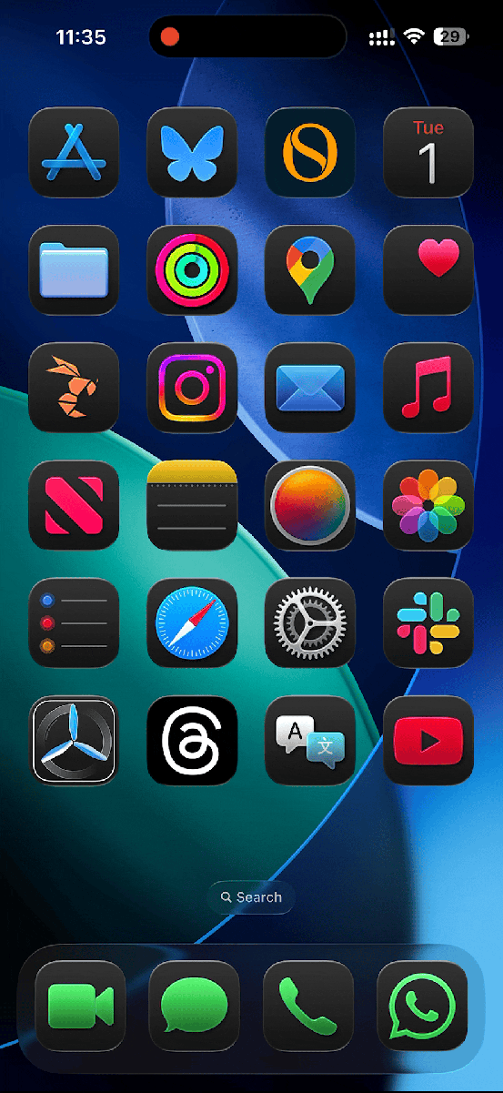
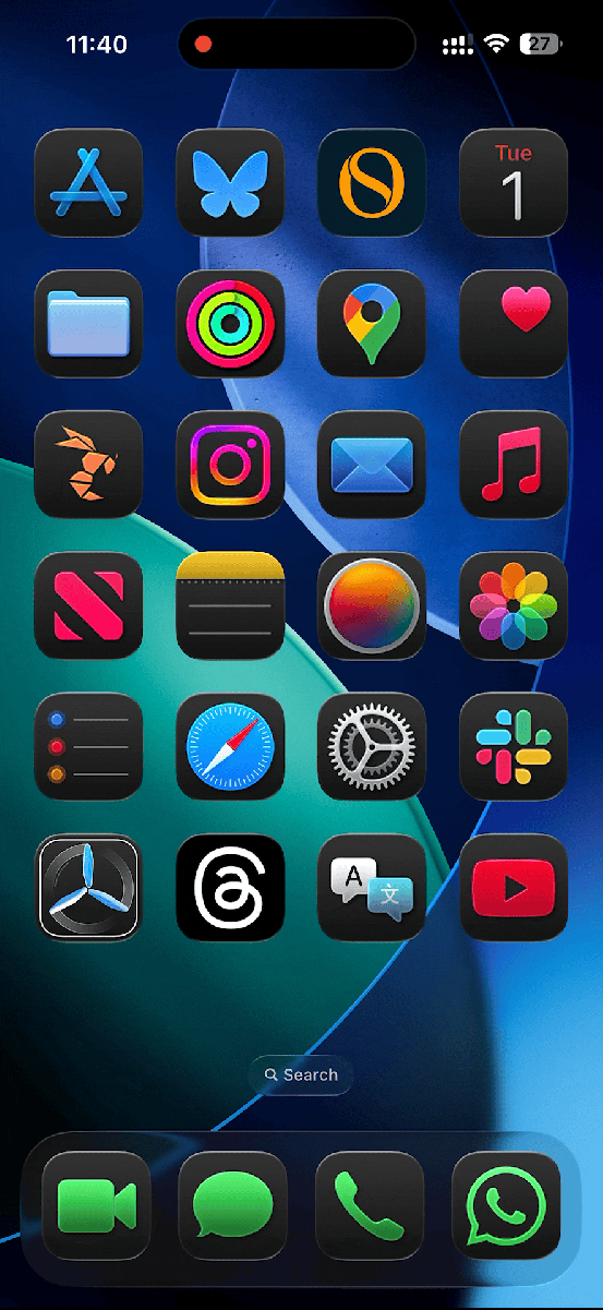
While the Liquid Glass overhaul has essentially been applied system-wide, it doesn’t tweak every single UI element. For starters, you’ve got a fresh set of Lock Screen clocks, Notification Center banners, and Control Center toggles that adopt the new look. The Home Screen similarly offers optional glassy variants of app icons, folders, and widgets, and their edges shimmer as you physically move your iPhone. Disregarding the glass, the Lock and Home Screens, along with the Control Center, remain largely unchanged, as the update is primarily cosmetic.
Foundry
A more functional change brought by Liquid Glass is how navigation bars and toolbars behave in supported apps. To fully utilize the larger iPhone displays and maximize immersion, navigation bars now dynamically shrink when you start scrolling through content. Similarly, certain toolbars, like that in the Notes app, now show individual, independent buttons that aren’t confined in a virtual box occupying the entire horizontal strip.
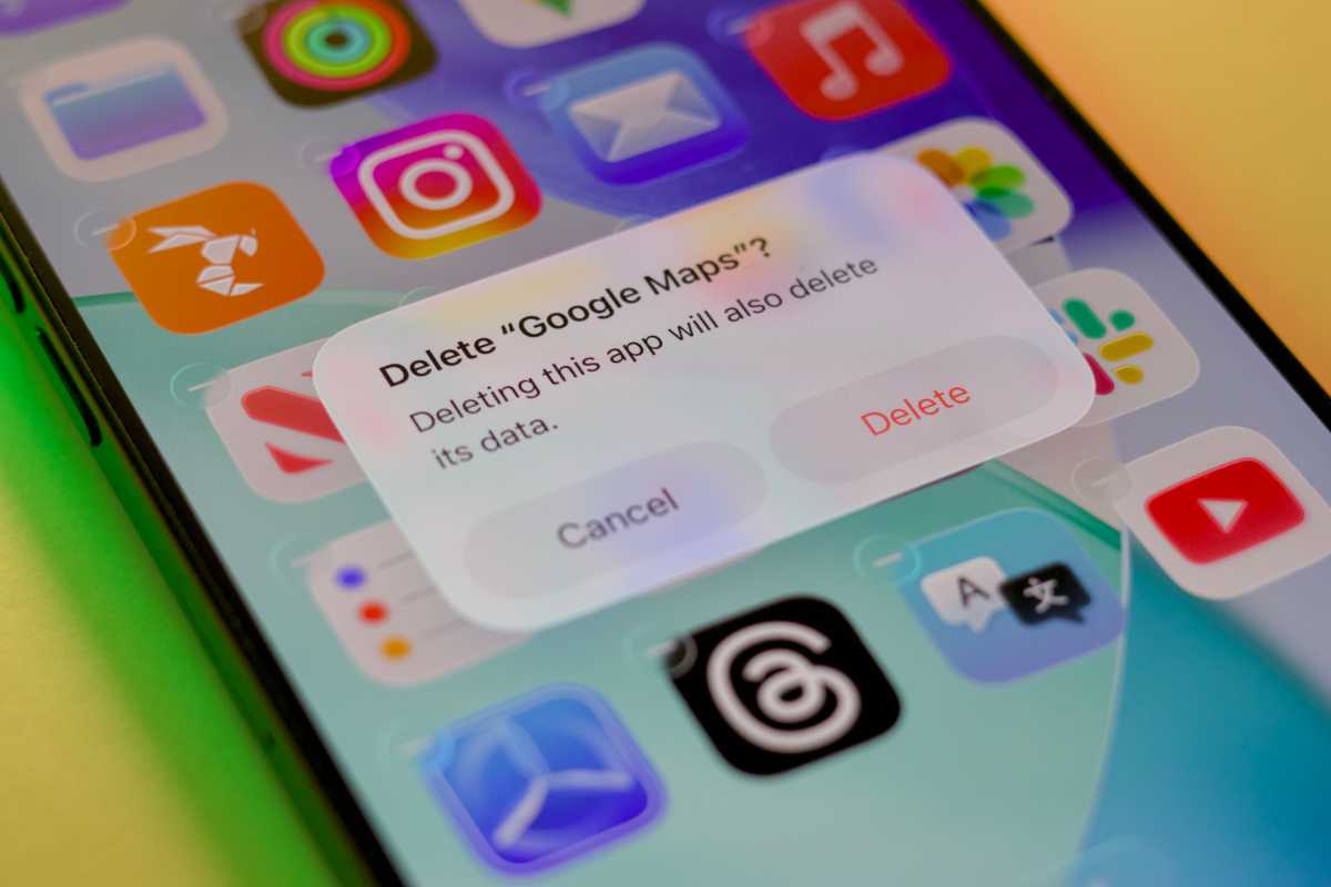
The new design language also impacts other OS areas, like three-dot menus and confirmation dialogs/alerts. Though for readability, these particular panels opt for an opaque, frosted glass design that makes their displayed text more legible. The default settings toggle and top-left back button have also been tweaked with iOS 26.
Liquid Glass can be felt all over iOS 26.
Foundry
It’s likely that Apple continues to experiment with different opacities until it finds one that strikes the right balance. The first beta was extremely transparent, and some beta testers found it jarring, while the 3rd beta significantly turned down the glass opacity on some menus and bars to appear more frosted rather than fully translucent.
Different but familiar
Liquid Glass changes how the iPhone’s core elements look without fundamentally altering their functions or placement. Thus, third-party apps will look significantly more modern—while maintaining their intuitiveness—when they start implementing Liquid Glass in September. With translucent, compact navigation bars, users will get to focus on the content and maintain context as they browse more than ever. It’ll impact how buttons are positioned and look, but not their main location. This ensures that, for the most part, the update won’t confuse users.
Perhaps the most outstanding aspect of Liquid Glass is Apple’s universal deployment across all of its platforms. Taking the various screen sizes and input methods into account, coming up with a single UI that works for all devices is no easy task. Now that all of the company’s operating systems share the same look, adding new elements and refining existing ones in the coming years should become more manageable. Apple no longer needs to build drastically different buttons for each OS.
Foundry
Rose-colored future
Some users have criticized certain Liquid Glass elements as out of place on iOS 26, an honest reaction many people may have when first using it. I felt the same way when I initially installed the betas on my devices. However, after weeks of use, my eyes have grown accustomed to how Liquid Glass appears and behaves on a 2D plane.
More important than this year’s iPhone, however, is the foundation of Liquid Glass. Apple is familiarizing its users with a new material, one that will make more sense on future Apple Vision devices. With Google and Meta revolutionizing how users interact with technology via their smart glasses, Apple wouldn’t want to miss the trend and fall behind.
Whenever the hardware is ready, users will be prepared for the look and feel of Liquid Glass everywhere.
Foundry